
Website Design for Google’s AI Experiences in 2026


With 46% of your traffic judging your company’s credibility on your website design, it’s important you get it right. We’ve taken a look at what works and what doesn’t to reveal the top 5 website design mistakes you will want to avoid.
If your web page takes less than 3 seconds to load, you will lose 40% of your traffic. You need to user-test each aspect of your web pages to make sure they are loading fast. If they aren’t, you need to find a way to compress them and speed up the process. In the meantime, using a video filler to keep your traffic amused could work as a short-term solution.
While your traffic probably IS looking at your website on a computer or laptop, you shouldn’t assume this is the case for everyone. In fact, more and more people are using their mobiles and tablets to search for products they want at home – even for B2B.
To make sure your website doesn’t look awful or becomes hard to use on a tablet or mobile, you will need to use responsive web design. Instead of just shrinking your whole page to fit, focus on a mobile first strategy. This way, you’ll be able to prioritise key features for a mobile friendly website and then add more content as you move to larger screens.
Content is an important part of your website that encourages engagement from your traffic. But too much of the “wrong” sort of content will only hinder your engagement levels. Whitepapers, guides and PDFs are good, but they aren’t the short, concise pieces of content audiences want.
Instead, invest in a video on your landing page and a blog section. The blog alone will get 55% more traffic than if you didn’t have one and videos on landing pages reportedly increase engagement rates by 86%.
You may want to tell your traffic everything about your company and product in one go. Our advice here is, don’t! Give them enough snippets of information that they want to interact with your call to action buttons and find out more about your company. You’ll see them start to move around the site and build a greater interest in you and your products.
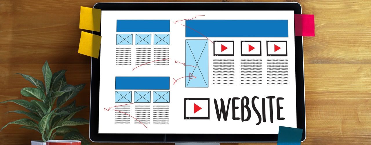
Remember, less is more and asymmetrical design elements will subconsciously keep your traffic looking around the web page. Where an even number causes the eye to stop in its tracks, an odd numbered arrangement will give the illusion there is more to see. Use white space effectively to enhance this experience and highlight features that you want your traffic to look at.
The rule of thumb is: a user should be able to get to where they want within 3 clicks. Any longer and they are likely to bounce to another website. Your user journey should be intuitive, so don’t make them search through a lengthy drop-down menu or hide important pages in random pockets of your website. Six key pages at the top should be enough to cover the buyer journey you want each user to go through.
If you are losing traffic through your user journey and you can’t figure out why, use CommuniGator’s visitor tracking software to see when they are leaving your website. From there, you can improve the aspects that are losing you qualified leads.
CommuniGator is Iconic Digital’s chosen email partner – we use their platform to deliver email campaigns for our clients, with tracking, results and more.